ページローディングのプログレスバーをCSSアニメーションで実装する
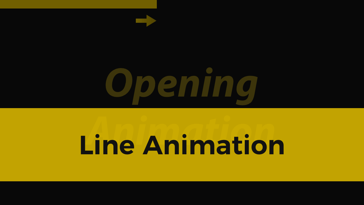
ページローディングのプログレスバーをCSSアニメーションで実装する方法です。少しのコードで表現できるので実装の手間はかからず予算少なめの案件でも提案しやすいのでおすすめです。
See the Pen
Opening animation by Kobayashi (@Pulp_Kobayashi)
on CodePen.
.opening::before {
	content: '';
	position: fixed;
	top: 0;
	left: 0;
	width: 100%;
	height: 100vh;
	background-color: #111;
	animation: opening 2.1s forwards;
}

@keyframes opening {
	99% {
		opacity: 1;
		z-index: 1;
	}
	100% {
		opacity: 0;
		z-index: -1;
	}
}疑似要素.opening::beforeでローディング時の背景(デモの場合黒背景)を表示します。width: 100%とheight: 100vhで全画面表示、background-color: #111で背景色指定。
animation: opening 2.1s forwardsのopeningで、その下の@keyframes openingのプロパティを適用します。ローディング時間の99%まではopacity: 1; z-index: 1;、100%でopacity: 0; z-index: -1;に変化させます。
z-index: -1を指定しないと、ページ全体に透明なフィルターをかけた状態になり、リンクやボタンのクリック、テキストの選択などアクションを起こせなくなりますので、下の階層へ下げます。
また、animationのforwardsでアニメーション完了時のスタイルがアニメーション完了後にも適用されるので指定しています。
.opening::after {
	content: '';
	position: fixed;
	top: 0;
	left: 0;
	width: 0;
	height: 10px;
	background-color: #d3ac07;
	animation: openingline 2s forwards;
}

@keyframes openingline {
	99% {
		width: 0;
		opacity: 1;
		z-index: 1;
	}

	100% {
		width: 100%;
		opacity: 0;
		z-index: -1;
	}
}疑似要素.opening::afterでローディング時のラインアニメーションを表現します。
top: 0で画面上部に配置、left: 0が開始位置です。99%までwidth: 0; opacity: 1; z-index: 1;、100%でwidth: 100%; opacity: 0; z-index: -1;と変化。これで画面上部の左から右へアニメーションしていき、完了後は非表示にしています。
こちらもz-index: -1とanimation: forwardsを指定し、ラインを非表示にしています。
人気記事
-

便利なChrome拡張機能を見直してみた
-
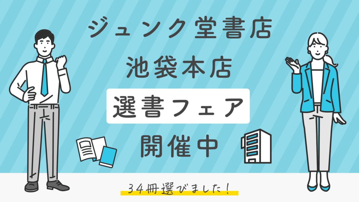
ジュンク堂書店池袋本店の選書フェアで選んだ34冊の中から9冊を紹介してみる
-

著書「現場で使えるWebデザインアイデアレシピ」を執筆しました
-

2022年版 Web制作が捗るChrome拡張機能14選
-

2021年を振り返る!Web制作関連の人気記事をあつめてみた
Warning: Undefined variable $ranking in /home/xs485436/pulpxstyle.com/public_html/wp-content/themes/pulpnote/single.php on line 294